tl;dr
- Unless you do something about it, providing more than 3 items in the
BottomNavigationBarmakes all the items (almost) disappear - Setting the type to
BottomNavigationBarType.fixedis one simple way to fix the issue - If you want to go for a
BottomNavigationBarthat has a switching background and Icons that are moving dynamically, assign abackgroundColorproperty for every item instead - Jump directly to the solutions to see an example
When using a BottomNavigationBar in Flutter, the children are provided as a List of BottomNavigationBarItem which contains all the relevant information for displaying itself.
The issue arises if you provide more that three of those children to the BottomNavigationBar: all items become invisible.
According to the material guidelines, 3-5 items in the bottom navigation are totally fine, so too many items can not be the cause.
But let’s examine this a little bit further before we come to any conclusions.
Minimal code example
First we consider a working example with three items and create something like this:
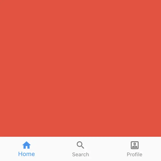
BottomNavigationBar with BottomNavigationBarType.fixed and 3 itemsBottomNavigationBar with three items
The code to achieve the above result is at follows:
 1class _MoreThanThreeIconsState extends State<MoreThanThreeIcons> {
 2  final PageController _pageController = PageController(initialPage: 0);
 3  int _pageIndex = 0;
 4
 5  @override
 6  Widget build(BuildContext context) {
 7    return Scaffold(
 8      body: PageView(
 9        children: _buildThreePageViewChildren(),
10        controller: _pageController,
11        physics: const NeverScrollableScrollPhysics(),
12        onPageChanged: (int index) {
13          setState(
14            () {
15              _pageIndex = index;
16            },
17          );
18        },
19      ),
20      bottomNavigationBar: BottomNavigationBar(
21        items: _buildThreeItems(),
22        onTap: (int index) {
23          _pageController.animateToPage(
24            index,
25            duration: const Duration(milliseconds: 200),
26            curve: Curves.easeInOut,
27          );
28        },
29        currentIndex: _pageIndex,
30        fixedColor: Theme.of(context).primaryColor,
31      ),
32    );
33  }
34
35  List<Widget> _buildThreePageViewChildren() {
36    return <Widget>[
37      Container(color: Colors.red),
38      Container(color: Colors.blue),
39      Container(color: Colors.green),
40    ];
41  }
42
43  List<BottomNavigationBarItem> _buildThreeItems() {
44    return const <BottomNavigationBarItem>[
45      BottomNavigationBarItem(
46        icon: Icon(Icons.home),
47        label: 'Home',
48      ),
49      BottomNavigationBarItem(
50        icon: Icon(Icons.search_rounded),
51        label: 'Search',
52      ),
53      BottomNavigationBarItem(
54        icon: Icon(Icons.account_box_outlined),
55        label: 'Profile',
56      ),
57    ];
58  }
59}
It’s a minimal example with a BottomNavigationBar and a PageView.
I chose to have a different background color for every container so that we can clearly see the animation switch on tapping a button in the bar.
The result looks as follows:
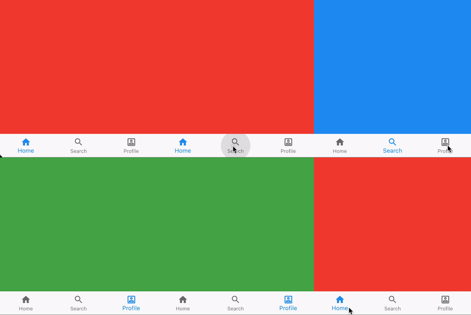
BottomNavigationBar with BottomNavigationBarType.fixed and 3 itemsTotally expected for the code we have written. We have three items aligned with equal spacing. On click the handler changes the index and thus the page of the PageView.
BottomNavigationBar with four items
Now we change the number of elements from three to four, which is a very common use case:
 1List<BottomNavigationBarItem> _buildFourItems() {
 2  return const <BottomNavigationBarItem>[
 3    BottomNavigationBarItem(
 4      icon: Icon(Icons.home),
 5      label: 'Home',
 6      backgroundColor: Colors.red,
 7    ),
 8    BottomNavigationBarItem(
 9      icon: Icon(Icons.search_rounded),
10      label: 'Search',
11      backgroundColor: Colors.blue,
12    ),
13    BottomNavigationBarItem(
14      icon: Icon(Icons.account_box_outlined),
15      label: 'Profile',
16      backgroundColor: Colors.green,
17    ),
18    BottomNavigationBarItem(
19      icon: Icon(Icons.account_box_outlined),
20      label: 'Settings',
21      backgroundColor: Colors.yellow,
22    ),
23  ];
24}
Now the surprising result:
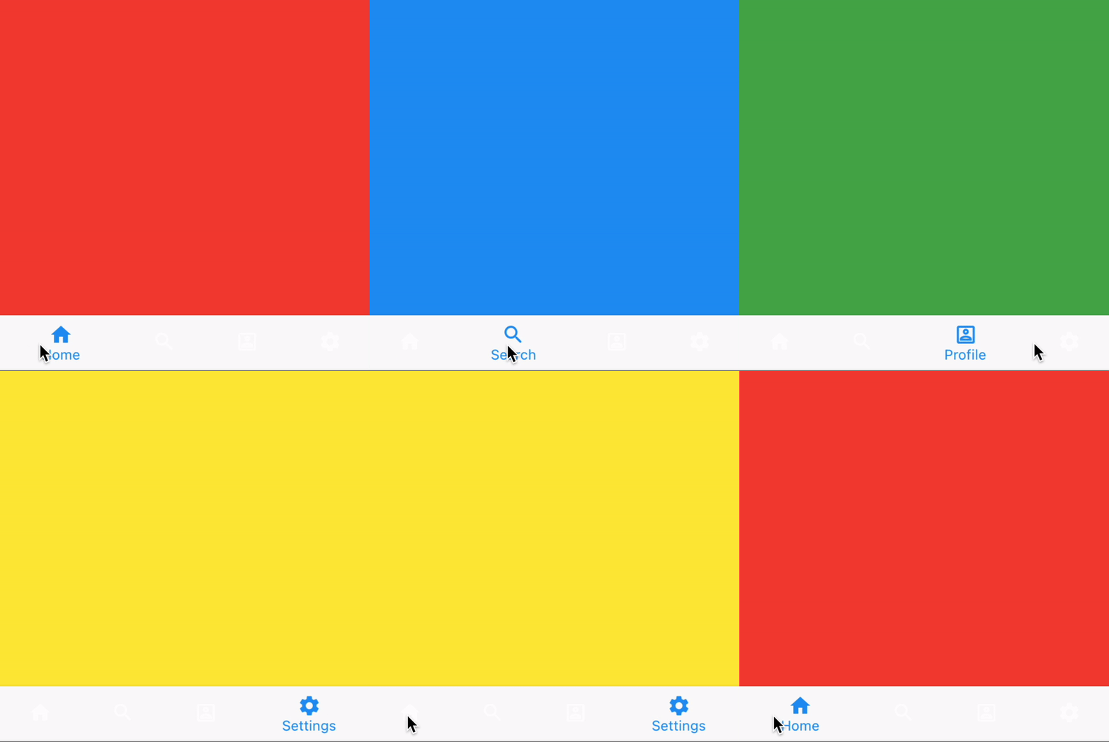
BottomNavigationBar with more than 3 itemsThe items seem to have disappeared. If you look closely, though, you can see that the items are not entirely hidden, but they are white which makes them almost disappear on the light background.
The question is: why do they appear in white when we have more than three items? Seems a little bit arbitrary, doesn’t it?
Explanation
Actually, the docs clearly state the behavior:
BottomNavigationBarType.fixed, the default when there are less than four items. The selected item is rendered with the selectedItemColor if it's non-null, otherwise the theme's ColorScheme.primary color is used for Brightness.light themes and ColorScheme.secondary for Brightness.dark themes. If backgroundColor is null, The navigation bar's background color defaults to the Material background color, ThemeData.canvasColor (essentially opaque white).Alright, this explains why we see the items of the bar in blue in the first example. But it does not yet explain the behavior with more than three icons.
Let’s read further:
BottomNavigationBarType.shifting, the default when there are four or more items. If selectedItemColor is null, all items are rendered in white. The navigation bar's background color is the same as the BottomNavigationBarItem.backgroundColor of the selected item. In this case it's assumed that each item will have a different background color and that background color will contrast well with white.
Okay, to sum it up:
- The bar has a type (
BottomNavigationBarType), which can be set using thetypeproperty - The property does not default to a static value, but a rather a dynamic value which depends on the number of items that are provided
- For less than four items, it defaults to
BottomNavigationBarType.fixed, for more items, it defaults toBottomNavigationBarType.shifting - The type
BottomNavigationBarType.shiftingsets the background of the bar to the background color of the item, which isnullin our case
Digging deeper
But why exactly does null lead to this result? The color could also be black, red or transparent. Why exactly this light tone?
To figure this out, let’s have a look into the implementation.
Internally, the BottomNavigationBar uses the _Bar widget, to which it forwards the backgroundColor which is derived from the BottomNavigationBar.type:
 1class _Bar extends StatelessWidget {
 2  const _Bar({
 3    Key? key,
 4    required this.child,
 5    required this.layout,
 6    required this.elevation,
 7    required this.color,
 8  }) : super(key: key);
 9
10  final Widget child;
11  final BottomNavigationBarLandscapeLayout layout;
12  final double elevation;
13  final Color? color;
14
15  @override
16  Widget build(BuildContext context) {
17    // …
18    return Material(
19      elevation: elevation,
20      color: color,
21      child: alignedChild,
22    );
23  }
24}
It seems like this color is then inserted into a Material widget.
Again, let’s have a look at the default value for color of this widget:
 1class Material extends StatefulWidget {
 2  const Material({
 3    Key? key,
 4    this.type = MaterialType.canvas,
 5    this.elevation = 0.0,
 6    this.color,
 7    this.shadowColor,
 8    this.textStyle,
 9    this.borderRadius,
10    this.shape,
11    this.borderOnForeground = true,
12    this.clipBehavior = Clip.none,
13    this.animationDuration = kThemeChangeDuration,
14    this.child,
15  }) :  assert(type != null),
16        assert(elevation != null && elevation >= 0.0),
17        assert(!(shape != null && borderRadius != null)),
18        assert(animationDuration != null),
19        assert(!(identical(type, MaterialType.circle) && (borderRadius != null || shape != null))),
20        assert(borderOnForeground != null),
21        assert(clipBehavior != null),
22        super(key: key);
23
24  final Widget? child;
25  final MaterialType type;
26
27  /// By default, the color is derived from the [type] of material.
28  final Color? color;
29
30  // Irrelevant content striped out by me
31
32}
Okay so if the color ist not set (e. g. null like in our case), it becomes the value defined by the given MaterialType.
Since the type is not set either, it defaults to MaterialType.canvas.
But what color is the type canvas mapped to? For this, we have to look into the State of the Material widget.
 1class _MaterialState extends State<Material> with TickerProviderStateMixin {
 2  final GlobalKey _inkFeatureRenderer = GlobalKey(debugLabel: 'ink renderer');
 3
 4  Color? _getBackgroundColor(BuildContext context) {
 5    final ThemeData theme = Theme.of(context);
 6    Color? color = widget.color;
 7    if (color == null) {
 8      switch (widget.type) {
 9        case MaterialType.canvas:
10          color = theme.canvasColor;
11          break;
12        case MaterialType.card:
13          color = theme.cardColor;
14          break;
15        case MaterialType.button:
16        case MaterialType.circle:
17        case MaterialType.transparency:
18          break;
19      }
20    }
21    return color;
22  }
23
24  // …
25}
Oh, we’re still not having a concrete color value. However, from what we can observe, in the end, the background color of our BottomNavigatiorBarItems is directly dependent on the theme if not explictily set.
Now the next thing we have to into is the MaterialApp widget because there the theme is set:
1  /// Default visual properties, like colors fonts and shapes, for this app's
2  /// material widgets.
3  ///
4  /// A second [darkTheme] [ThemeData] value, which is used to provide a dark
5  /// version of the user interface can also be specified. [themeMode] will
6  /// control which theme will be used if a [darkTheme] is provided.
7  ///
8  /// The default value of this property is the value of [ThemeData.light()].
9  final ThemeData? theme;
Looking at the description of the theme property, we can conclude that ThemeData.light() is chosen as the default value.
However, our journey has not ended yet. We haven’t found out the exact place the color derives from, have yet only found out what Theme this originates in.
ThemeData.light() is a factory:
1factory ThemeData.light() => ThemeData(brightness: Brightness.light);
It seems like it’s a factory constructor calling the next factory constructor (of ThemeData).
And there we have it:
1factory ThemeData({
2// …
3}) {
4  final Brightness _brightness = brightness ?? colorScheme?.brightness ?? Brightness.light;
5  final bool isDark = _brightness == Brightness.dark;
6  // …
7  canvasColor ??= isDark ? Colors.grey[850]! : Colors.grey[50]!;
8  // …
9}
Okay now we have the Color object. What hex code is it, exactly? Let’s look into MaterialColor
 1static const MaterialColor grey = MaterialColor(
 2  _greyPrimaryValue,
 3  <int, Color>{
 4     50: Color(0xFFFAFAFA),
 5    100: Color(0xFFF5F5F5),
 6    200: Color(0xFFEEEEEE),
 7    300: Color(0xFFE0E0E0),
 8    350: Color(0xFFD6D6D6),
 9    400: Color(0xFFBDBDBD),
10    500: Color(_greyPrimaryValue),
11    600: Color(0xFF757575),
12    700: Color(0xFF616161),
13    800: Color(0xFF424242),
14    850: Color(0xFF303030),
15    900: Color(0xFF212121),
16  },
17);
Wow, what a journey! We finally found out that the color of the BottomNavigationBar is defined in the ThemeData and is currently set to #FAFAFA because we’re not explicitly setting a theme which makes it default to the ThemeData.light theme.
Solutions
Since we found out that the disappearance of the items is not an actual disappearance and caused by an implicit type change dependent on the number of items, we are left with two options.
Setting BottomNavigationBarType.fixed explicitly
The first option is preventing the type switch (which also leads to a switch of background color) by explicitly setting the type Parameter of the BottomNavigationBar to BottomNavigationBarType.fixed:
1BottomNavigationBar(
2  items: …,
3  onTap: …,
4  currentIndex: …,
5  type: BottomNavigationBarType.fixed
6)
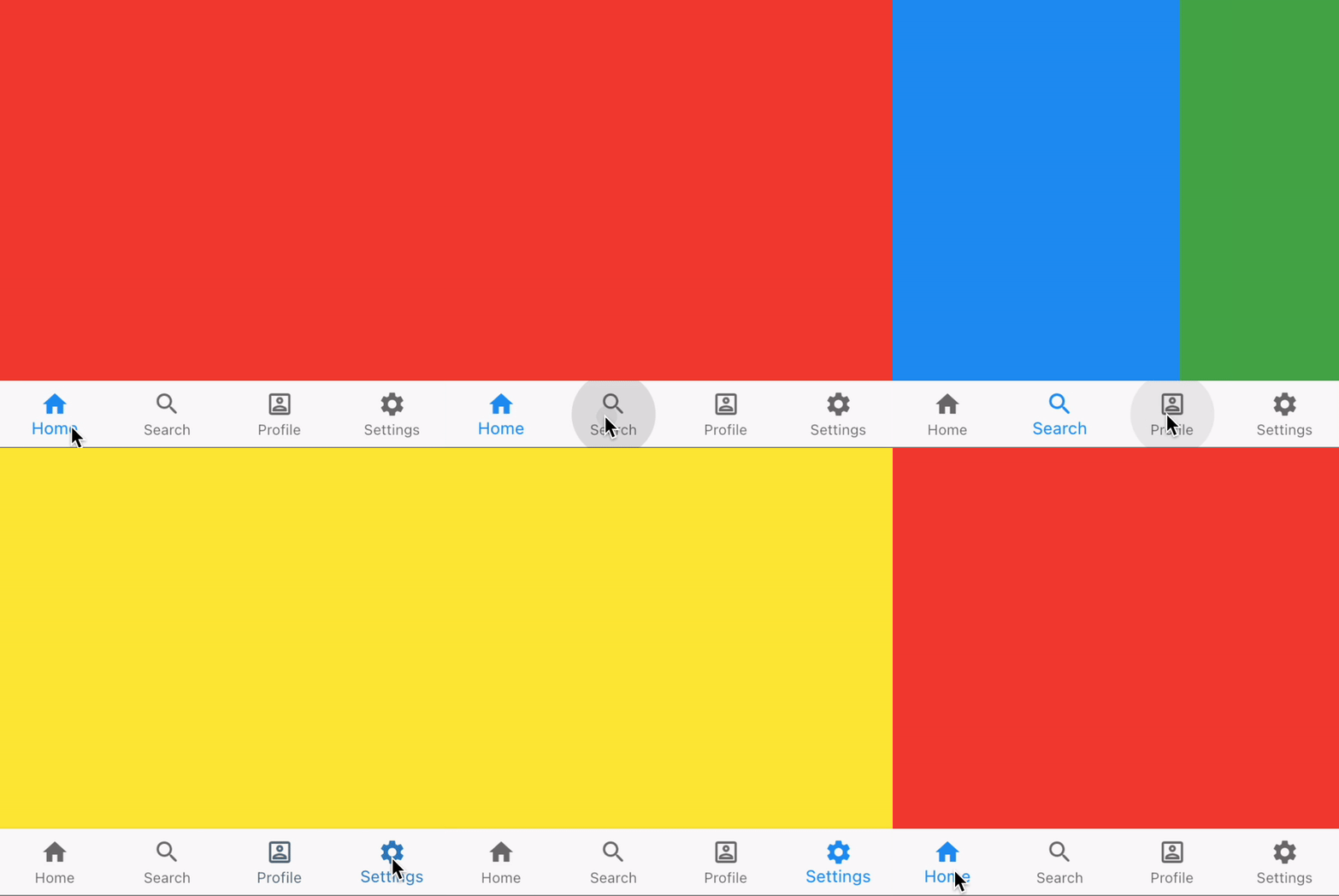
BottomNavigationBar with BottomNavigationBarType.fixed (explicitly set) and 4 itemsProvide a background color for every item
The second option is providing a backgroundColor to every BottomNavigationBarItem so that the icons and labels become more visible
 1BottomNavigationBar(
 2  items: <BottomNavigationBarItem>[
 3    BottomNavigationBarItem(
 4      icon: Icon(Icons.home),
 5      label: 'Home',
 6      backgroundColor: Colors.red,
 7    ),
 8    BottomNavigationBarItem(
 9      icon: Icon(Icons.search_rounded),
10      label: 'Search',
11      backgroundColor: Colors.blue,
12    ),
13    BottomNavigationBarItem(
14      icon: Icon(Icons.account_box_outlined),
15      label: 'Profile',
16      backgroundColor: Colors.green,
17    ),
18    BottomNavigationBarItem(
19      icon: Icon(Icons.account_box_outlined),
20      label: 'Settings',
21      backgroundColor: Colors.yellow,
22    ),
23  ],
24  onTap: …,
25  currentIndex: …,
26)
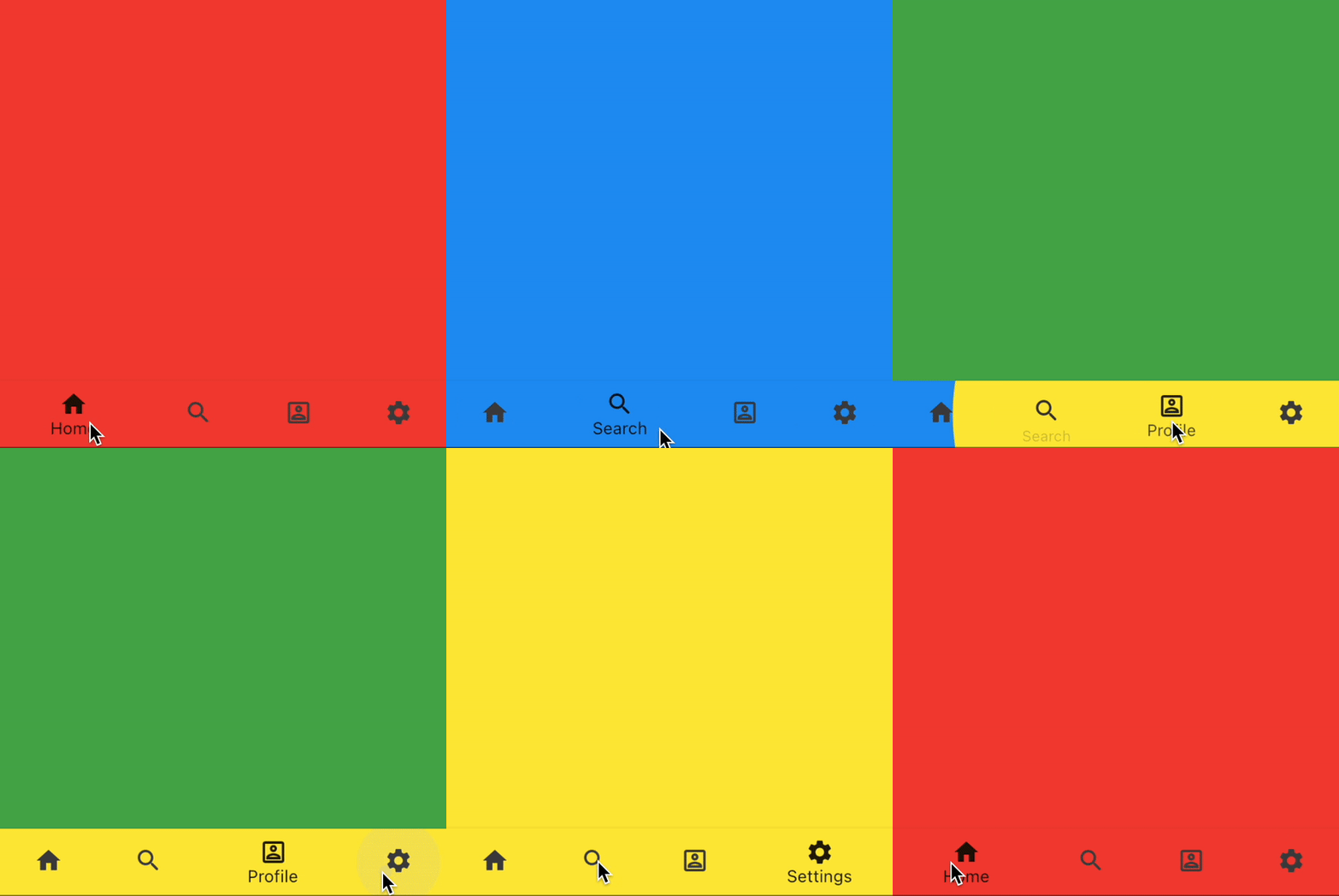
BottomNavigationBar with BottomNavigationBarType.shifting and 4 itemsConclusion
After having read a little bit of documentation and done some digging through the code, the reasons for the above behavior become clear.
However, in my opinion, this is not a very intuitive way of a widget API design. Independent of internal logic of theming, when adding an item to the navigation bar, I would not expect all items to be suddenly barely visible.
A meaningful API change could be that not setting the type property would default to BottomNavigationBarType.fixed. No amount of items involved in this decision.
This would lead to the developer explicitly deciding when he wants to have the shifting type.
I think being required to read the documentation to understand the behavior is not a good sign regarding usability.


Kristin