Especially when working with Rows and Columns one can quickly run into problems that result in the often seen black-and-yellow-striped overlay on top of your widgets.
I want to clarify why this happens and talk about the most common errors and solutions.
Why does overflow happen anyways?
In Flutter, the dimensions of a widget are determined by the constraints it gets from its parent. These constraints are very simple, they consist of width and height, each with a min and max value. The child widget receives these constraints and brings them in line with its own wanted size.
There are, however, widgets that do not impose any constraints onto their children. That’s the case for the Row and Column widget. This can lead to a situation where the child exceeds the dimensions of the Row or Column which leads to this overflow error.
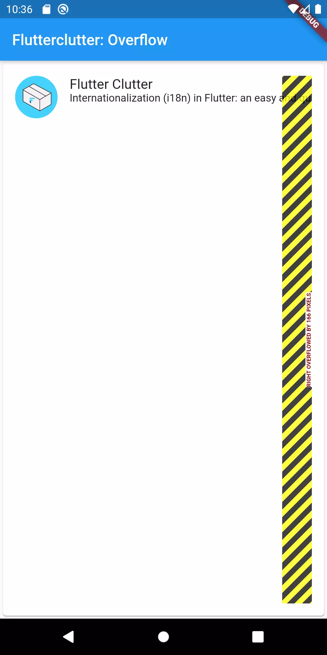
Let’s reproduce this error by implementing a common scenario: a list of cards with an image on the left and a text that has a dynamic length. In this case a screen that lists different blogs and shows their latest article:

I want to address the overflow issues one by one.
Row with right overflow
This is the code that is used for a single card:
 1Card(
 2  child: Padding(
 3    padding: EdgeInsets.all(16),
 4    child: Row(
 5      crossAxisAlignment: CrossAxisAlignment.start,
 6      children: [
 7        Image.asset('assets/fc-logo.png', width: 56, height: 56),
 8        Padding(
 9          padding: EdgeInsets.symmetric(horizontal: 16),
10          child: Column(
11            crossAxisAlignment: CrossAxisAlignment.start,
12            children: [
13              Text("Flutter Clutter", style: TextStyle(fontSize: 18)),
14              Text("Internationalization (i18n) in Flutter: an easy and quick approach")
15            ]
16          ),
17        ),
18        Spacer(),
19        Text("03.03.2020"),
20      ]
21    )
22  )
23);
Before we change the code, let’s think about what we want. We can’t change the fact that the text that comes from an external source does not have a uniform length. We can only change how the layout reacts to that. Now we have to ask ourselves if we want the text to be cut or to have a line break.
In any case we want to tell Flutter that the first column (the image) can stay the way it is with its width and height of 56 pixels whereas the text has to be told to only use the available space. This can be achieved with a widget called Expanded. We also need to remove the Spacer as it’s not needed anymore when the text takes up as much space as needed.
That makes the text do a line break if it does not fit. If we want the typical ellipsis dots, we can set overflow to TextOverflow.ellipsis.


Column with bottom overflow
If we had too little vertical space so that the widgets inside the card would not fit, we would have the same problem. We can simulate that by wrapping the card in a container that has a fixed height of e.g. 60 pixels.
In general, when dealing with vertical space issues we always have the option to turn a widget into a SingleChildScrollView. The best alternative to a Column is most often a ListView because it already has the scrolling capability. In our case, that does not make a lot of sense, though, as you can see:



So in this case we should just give the card enough vertical space and wrap the text in an Expanded widget as well:
 1Card(
 2  child: Padding(
 3    padding: EdgeInsets.all(16),
 4    child: Row(
 5      crossAxisAlignment: CrossAxisAlignment.start,
 6      children: [
 7        Image.asset('assets/fc-logo.png', width: 56, height: 56, fit: BoxFit.cover),
 8        Expanded(
 9          child: Padding(
10            padding: EdgeInsets.symmetric(horizontal: 16),
11            child: Column(
12              crossAxisAlignment: CrossAxisAlignment.start,
13              children: [
14                Text("Flutter Clutter", style: TextStyle(fontSize: 18)),
15                Expanded(child: Text("Well this is a pretty long title. I guess this will exceed the available space", overflow: TextOverflow.ellipsis,))
16              ]
17            )
18          ),
19        ),
20        Text("03.03.2020"),
21      ]
22    )
23  )
24);
It is worth noting that when no other parameters are given, the Image widget defaults its fit parameter to BoxFit.scaleDown. That would scale down the image if available space shrinks. If it is set to BoxFit.cover like above, the image size stays the same, no matter how the enclosing widget changes.
Fixing the parent widget
Now we have talked about the issues of the single cards in the list. The fix for the bottom overflow of the cards that are currently grouped in a Column widget is the same as discussed above: replace Column by ListView.


Wrap up
There can be numerous reasons for an overflow issue in Flutter. The most common that occurred to me were connected to the Row and Column widget.
We discussed ways to get around that by using the Expanded, SingleChildScrollView and ListView widgets.
If you have the need to go deeper into that topic, have a look at this excellent article of the Flutter team.


check it
Marc
In reply to check it's comment
Mahmoud