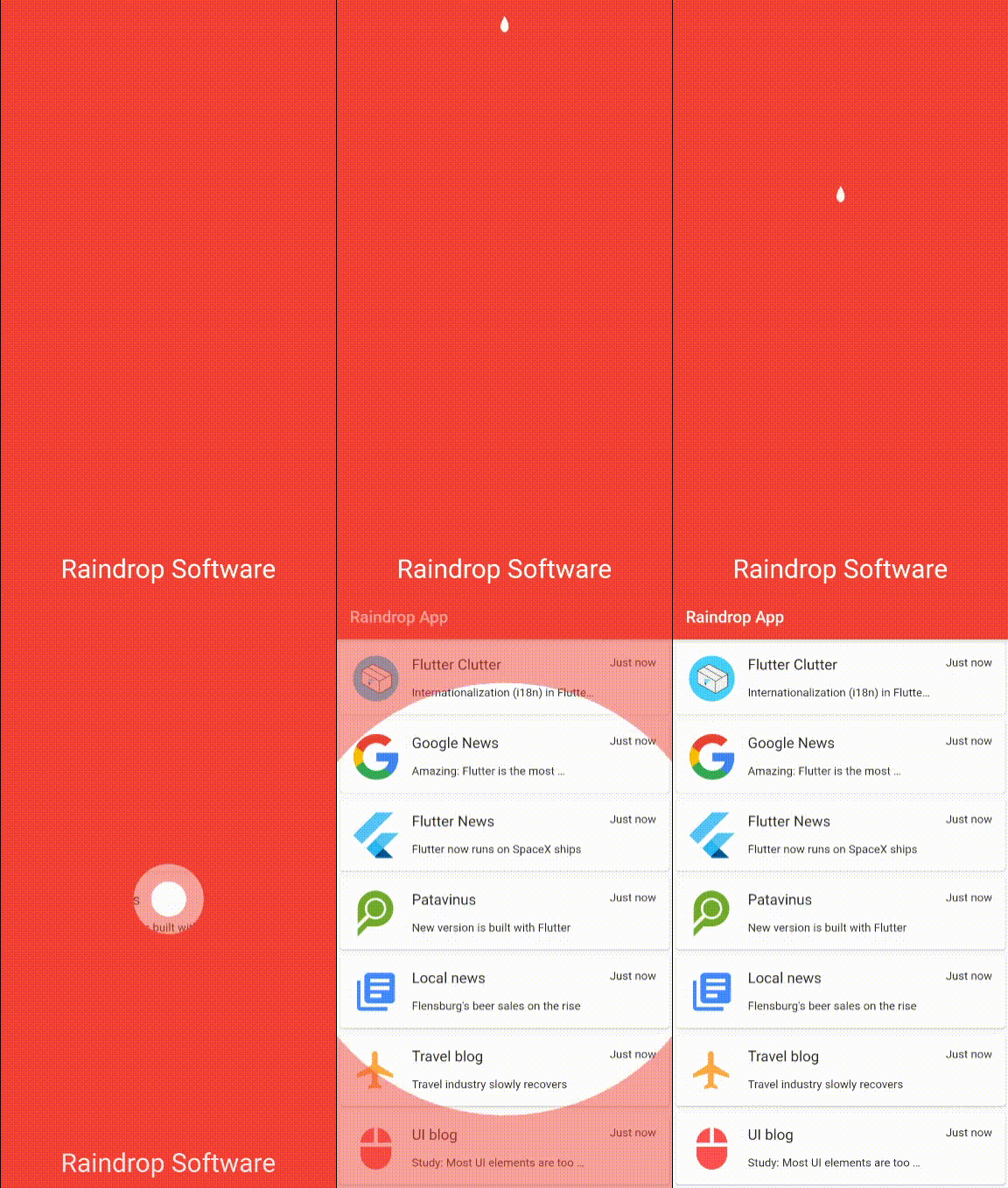
Splash screens are an excellent way of setting the scene for the rest of the app. By showing the user an immersive animation, the attention can be increased and become longer-lasting. Apart from that it can make your app stand out in the huge pool of similar looking user interfaces.
We will give it a try with a raindrop falling into a symbolic water surface with the caused waves revealing what’s underneath: the first screen of the app.
The goal

Let’s describe what we want the animation to be like:
- Everything is initially covered by a solid color and the name of the app is displayed at the bottom
- At the top center, a raindrop originates, growing from zero to its final size
- The raindrop falls down until the center of the screen and disappears
- Two circles begin to grow from the center: one inner circle and one outer circle
- The inner circle makes the underlying UI-elements fully transparent
- The outer circle forming a ring around the inner circle makes the underlying UI-elements 50 % visible
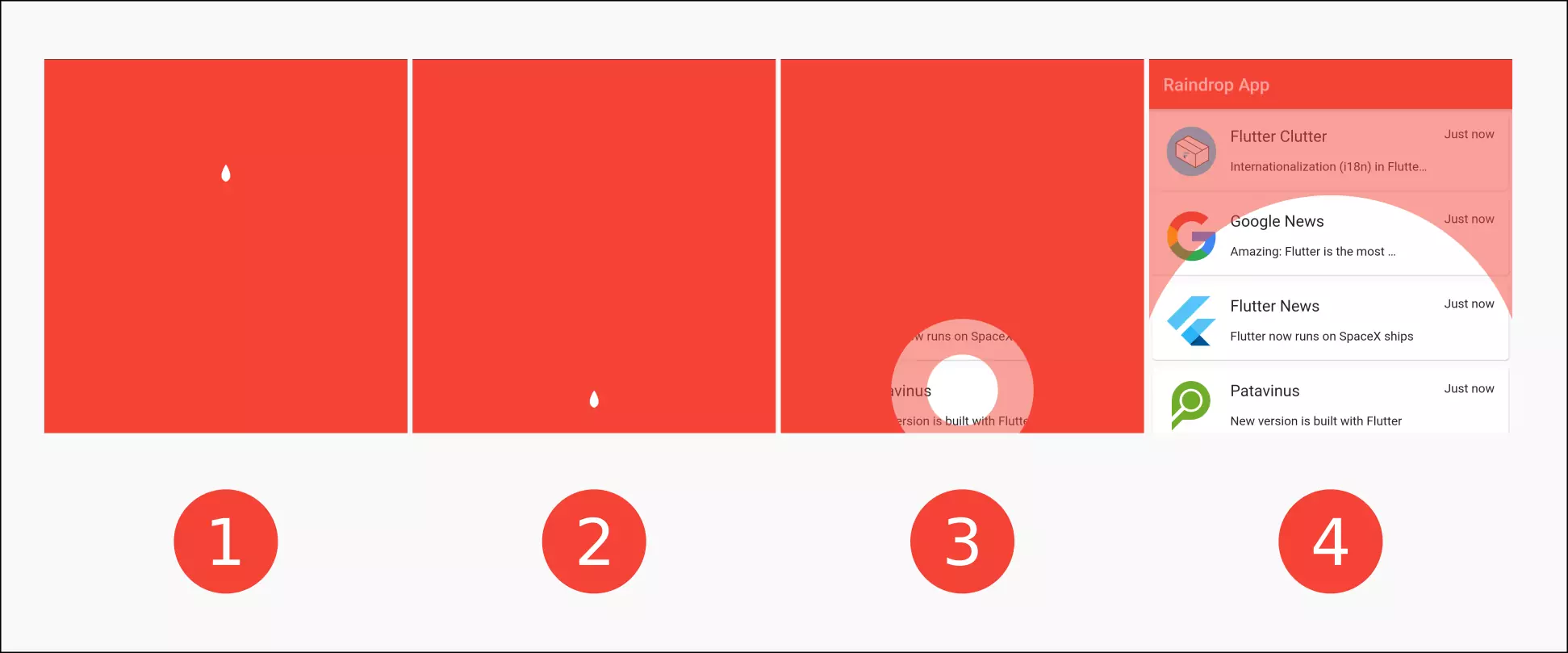
So roughly speaking we have these four phases:

It starts with a raindrop at the top, falling down (1). When the raindrop reaches 50 % of the height, it disappears (2) and a hole is created (3). It grows until the underlying widget is visible (4).
The implementation
Let’s start with the implementation by initializing the MaterialApp with our (to be implemented) raindrop animation and the actual first screen below that.
 1void main() {
 2  runApp(MyApp());
 3}
 4
 5class MyApp extends StatelessWidget {
 6  @override
 7  Widget build(BuildContext context) {
 8    SystemChrome.setEnabledSystemUIOverlays([SystemUiOverlay.bottom]);
 9    return MaterialApp(
10      debugShowCheckedModeBanner: false,
11      title: 'Raindrop App',
12      theme: ThemeData(
13        primarySwatch: Colors.red,
14        visualDensity: VisualDensity.adaptivePlatformDensity,
15      ),
16      home: MyHomePage(),
17    );
18  }
19}
20
21class MyHomePage extends StatefulWidget {
22  @override
23  _MyHomePageState createState() => _MyHomePageState();
24}
25
26class _MyHomePageState extends State<MyHomePage> {
27  @override
28  Widget build(BuildContext context) {
29    return Material(
30      child: Stack(
31        children: <Widget>[
32          Scaffold(
33            appBar: AppBar(
34              title: Text('Raindrop App'),
35            ),
36            body: ExampleStartScreen()
37          ),
38          AnimationScreen(
39            color: Theme.of(context).accentColor
40          )
41        ]
42      )
43    );
44  }
45}
We achieve this by using a Stack widget. Important: since we want to have all the benefits from a Scaffold widget but don’t want to nest it as this is not a good practice, we put the Scaffold containing the first real screen at the bottom of the Stack and our AnimationScreen on top of that. Not having a Scaffold above our AnimationScreen would mean that we miss our Theme. That would cause ugly text to be rendered and also we would not be able to access our theme color. That’s why we set Material as the root widget.
Animating the drop
 1class StaggeredRaindropAnimation {
 2  StaggeredRaindropAnimation(this.controller):
 3
 4  dropSize = Tween<double>(begin: 0, end: maximumDropSize).animate(
 5    CurvedAnimation(
 6      parent: controller,
 7      curve: Interval(0.0, 0.2, curve: Curves.easeIn),
 8    ),
 9  ),
10
11  dropPosition = Tween<double>(begin: 0, end: maximumRelativeDropY).animate(
12    CurvedAnimation(
13      parent: controller,
14      curve: Interval(0.2, 0.5, curve: Curves.easeIn),
15    ),
16  );
17
18  final AnimationController controller;
19
20  final Animation<double> dropSize;
21  final Animation<double> dropPosition;
22
23  static final double maximumDropSize = 20;
24  static final double maximumRelativeDropY = 0.5;
25}
We start by implementing a class that holds all the animations. Initially, we only want the drop to grow and then to move to the vertical center of the screen. The class is named StaggeredRaindropAnimation and expects the AnimationController as the only argument. The fields of the class are both of the animations dropSize and dropPosition which store the animations as well as maximumDropSize and maximumRelativeDropY which store the maximum value of the respective animations. In the constructor we initiate the animations using Tweens from 0 to the defined maximum values. The genesis of the raindrop claims the first 20 % of the time (0.0 to 0.2), the fall ranges from 20 % to 50 %.
 1class AnimationScreen extends StatefulWidget {
 2  AnimationScreen({
 3    this.color
 4  });
 5
 6  final Color color;
 7
 8  @override
 9  _AnimationScreenState createState() => _AnimationScreenState();
10}
11
12class _AnimationScreenState extends State<AnimationScreen> with SingleTickerProviderStateMixin {
13  Size size = Size.zero;
14  AnimationController _controller;
15  StaggeredRaindropAnimation _animation;
16
17  @override
18  void initState() {
19    super.initState();
20    _controller = AnimationController(
21      duration: const Duration(milliseconds: 3000),
22      vsync: this,
23    );
24    _animation = StaggeredRaindropAnimation(_controller);
25    _controller.forward();
26
27    _controller.addListener(() {
28      setState(() {});
29    });
30  }
31
32  @override
33  void didChangeDependencies() {
34    setState(() {
35      size = MediaQuery.of(context).size;
36    });
37    super.didChangeDependencies();
38  }
39
40  @override
41  Widget build(BuildContext context) {
42    return Stack(
43      children: [
44        Container(
45          color: widget.color
46        ),
47        Positioned(
48          top: _animation.dropPosition.value * size.height,
49          left: size.width / 2 - _animation.dropSize.value / 2,
50          child: SizedBox(
51            width: _animation.dropSize.value,
52            height: _animation.dropSize.value,
53            child: CustomPaint(
54              painter: DropPainter(),
55          )
56          )
57        )
58      ]
59    );
60  }
61
62  @override
63  void dispose() {
64    super.dispose();
65    _controller.dispose();
66  }
67}
We use a Stack widget as the root of the tree of our new widget AnimationScreen. At the bottom of the Stack widget we place a Container with the color from the constructor argument. One level above that, we create a Positioned widget. The top vale is the dropPosition (that ranges from 0 to 0.5) times the height, making it fall from the top to the center. As a child we place a SizedBox with the size of the drop that is also animated using the dropSize value.

Animating the hole
The moment the raindrop touches the center we want it do disappear and a hole to open. The hole should make the underlying UI elements visible. Around the hole there should be a ring that makes it half-transparent.
 1class StaggeredRaindropAnimation {
 2  StaggeredRaindropAnimation(this.controller):
 3
 4  dropSize = Tween<double>(begin: 0, end: maximumDropSize).animate(
 5    CurvedAnimation(
 6      parent: controller,
 7      curve: Interval(0.0, 0.2, curve: Curves.easeIn),
 8    ),
 9  ),
10
11  dropPosition = Tween<double>(begin: 0, end: maximumRelativeDropY).animate(
12    CurvedAnimation(
13      parent: controller,
14      curve: Interval(0.2, 0.5, curve: Curves.easeIn),
15    ),
16  ),
17
18  holeSize = Tween<double>(begin: 0, end: maximumHoleSize).animate(
19    CurvedAnimation(
20      parent: controller,
21      curve: Interval(0.5, 1.0, curve: Curves.easeIn),
22    ),
23  ),
24
25  dropVisible = Tween<bool>(begin: true, end: false).animate(
26    CurvedAnimation(
27      parent: controller,
28      curve: Interval(0.5, 0.5),
29    ),
30  );
31
32  final AnimationController controller;
33
34  final Animation<double> dropSize;
35  final Animation<double> dropPosition;
36  final Animation<bool> dropVisible;
37  final Animation<double> holeSize;
38
39  static final double maximumDropSize = 20;
40  static final double maximumRelativeDropY = 0.5;
41  static final double maximumHoleSize = 10;
42}
In our StaggeredRaindropAnimation we add two new animations: holeSize and dropVisible. The hole should only start to grow when the raindrop reaches the center. Hence we set the interval range from 0.5 to 1.0. At the same time the drop is to disappear.
Next, we need a painter that takes the animated holeSize and uses it to draw a growing hole to the center.
 1class HolePainter extends CustomPainter {
 2  HolePainter({
 3    @required this.color,
 4    @required this.holeSize,
 5  });
 6
 7  Color color;
 8  double holeSize;
 9
10  @override
11  void paint(Canvas canvas, Size size) {
12    double radius = holeSize / 2;
13    Rect rect = Rect.fromLTWH(0, 0, size.width, size.height);
14    Rect outerCircleRect = Rect.fromCircle(center: Offset(size.width / 2, size.height / 2), radius: radius);
15    Rect innerCircleRect = Rect.fromCircle(center: Offset(size.width / 2, size.height / 2), radius: radius / 2);
16
17    Path transparentHole = Path.combine(
18      PathOperation.difference,
19      Path()..addRect(
20          rect
21      ),
22      Path()
23        ..addOval(outerCircleRect)
24        ..close(),
25    );
26
27    Path halfTransparentRing = Path.combine(
28      PathOperation.difference,
29      Path()
30        ..addOval(outerCircleRect)
31        ..close(),
32      Path()
33        ..addOval(innerCircleRect)
34        ..close(),
35    );
36
37    canvas.drawPath(transparentHole, Paint()..color = color);
38    canvas.drawPath(halfTransparentRing, Paint()..color = color.withOpacity(0.5));
39  }
40
41  @override
42  bool shouldRepaint(CustomPainter oldDelegate) {
43    return true;
44  }
45}
In the same matter that is used in my tutorial on how to cut a hole in an overlay, we first draw a rectangle that fills the hole size of the canvas. Then we create a hole by using PathOperation.difference to substract a centered oval from the rect. We then use a hole with half of the radius and subtract that from the bigger oval to have the half-transparent outer ring.
Lastly, we need to replace the solid color in the background by the HolePainter we have just created.
 1@override
 2  Widget build(BuildContext context) {
 3    return Stack(
 4      children: [
 5        Container(
 6          width: double.infinity,
 7          height: double.infinity,
 8          child: CustomPaint(
 9            painter: HoleAnimationPainter(
10              color: widget.color,
11              holeSize: _animation.holeSize.value * size.width
12            )
13          )
14        ),
15        Positioned(
16          top: _animation.dropPosition.value * size.height,
17          left: size.width / 2 - _animation.dropSize.value / 2,
18          child: SizedBox(
19            width: _animation.dropSize.value,
20            height: _animation.dropSize.value,
21            child: CustomPaint(
22              painter: DropPainter(
23                visible: _animation.dropVisible.value
24              ),
25          )
26          )
27        )
28      ]
29    );
30  }
Adding some text
A splash screen mostly contains the logo or the title of your app. Let’s extend the existing solution by displaying a text that is faded in and out.
 1class StaggeredRaindropAnimation {
 2  ...
 3  textOpacity = Tween<double>(begin: 1, end: 0).animate(
 4    CurvedAnimation(
 5      parent: controller,
 6      curve: Interval(0.5, 0.7, curve: Curves.easeOut),
 7    ),
 8  );
 9  ...
10  final Animation<double> textOpacity;
11  ...
12}
 1Padding(
 2  padding: EdgeInsets.only(bottom: 32),
 3  child: Align(
 4    alignment: Alignment.bottomCenter,
 5    child: Opacity(
 6      opacity: _animation.textOpacity.value,
 7      child: Text(
 8        'Raindrop Software',
 9        style: TextStyle(
10          color: Colors.white, fontSize: 32
11        ),
12      )
13    )
14  )
15)
We let the text be there from the beginning and disappear between 50 % and 70 % of the animation so that it’s readable most of the time but disappears when the hole reaches its boundaries.
Flexibility
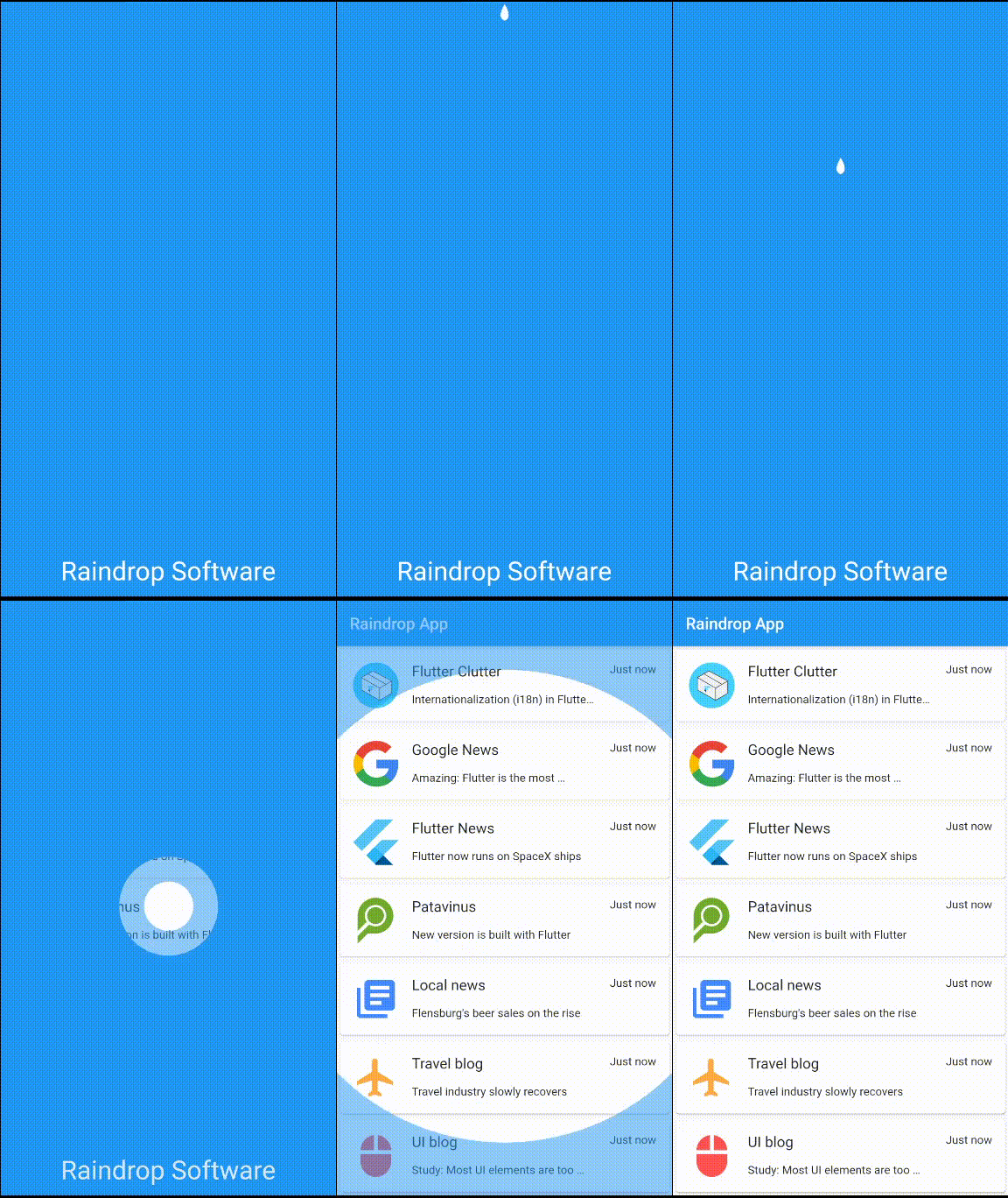
If we provide the accent color to the animation, the color of the animation changes along with that.

The UI is not scrollable
You might have noticed that after the underlying UI has become visible, you can not interact with it. No gesture is being recognized. That’s because we haven’t told Flutter to forward the captures gestures. We use an IgnorePointer to fix that.
Usage as splash screen
Okay, so we created an animation that looks like a splash screen. But how do we use it as such? Well, neither Android nor iOS provides the possibility to have an animated splash screen. However, we can create the illusion of this animation belonging to the splash screen by having a seamless transition from the static one. In order to achieve that, we let the OS specific launch screen be a screen with only one color (the very same color we use for the animation).
1<?xml version="1.0" encoding="utf-8"?>
2<resources>
3    <style name="LaunchTheme" parent="@android:style/Theme.Black.NoTitleBar">
4        <!-- Show a splash screen on the activity. Automatically removed when
5             Flutter draws its first frame -->
6        <item name="android:windowBackground">@drawable/launch_background</item>
7    </style>
8    <color name="primary_color">#FF71ac29</color>
9</resources>
1<?xml version="1.0" encoding="utf-8"?>
2<!-- Modify this file to customize your launch splash screen -->
3<layer-list xmlns:android="http://schemas.android.com/apk/res/android">
4    <item android:drawable="@color/primary_color" />
5</layer-list>
For Android, we edit the files android/app/src/main/res/drawable/launch_background.xml and android/app/src/main/res/values/styles.xml like it can be seen above where primary_color needs to be set to our splash color.
On iOS, an empty splash screen has already been set up. To change it, you need to open the Flutter app with Xcode project. Afterwards select Runner/Assets.xcassets from the Project Navigator and change the given color to the one of our splash screen.
For more information have a look at Flutter’s official page about splash screens.
Final thoughts
We have created an animated splash screen by stacking an animation with transparent elements on top of our first app screen. The transition from the native splash screen to that animation is achieved by having a static color screen that looks exactly like the first frames of our animation.
GET FULL CODE


Comment this 🤌