Especially in app development, you’re often faced with asynchronous operations. That’s because the UI thread must not be blocked since at any time the user should be able to interact with the app and that requires drawing on the screen, which happens in the UI thread.
If there’s anything the user has to wait for, we still want to indicate this circumstance. That’s what progress indicators are for.
Ideally, the progress indicator is shown on top of everything, preventing the user from interacting with the UI.
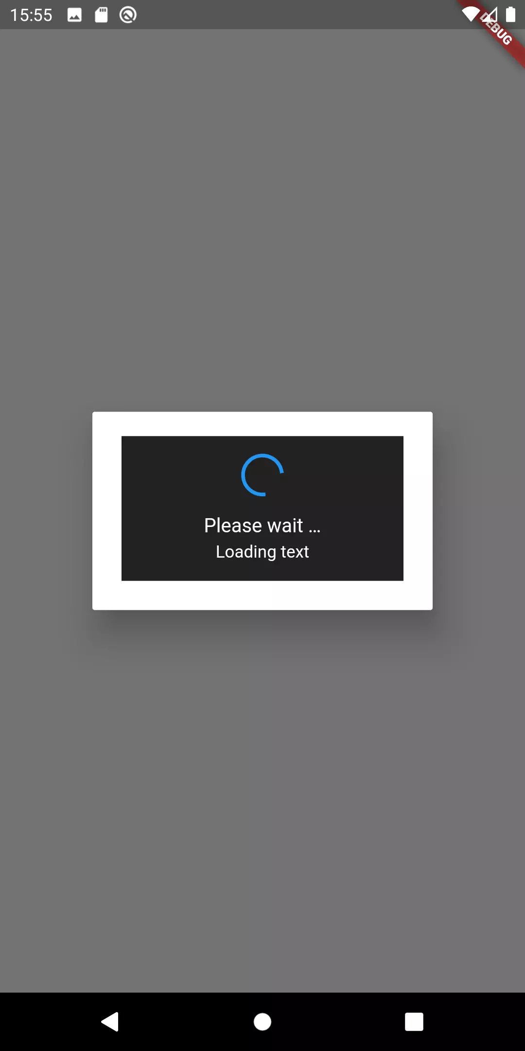
Let’s build a progress indicator that looks like this:

What does Flutter provide?
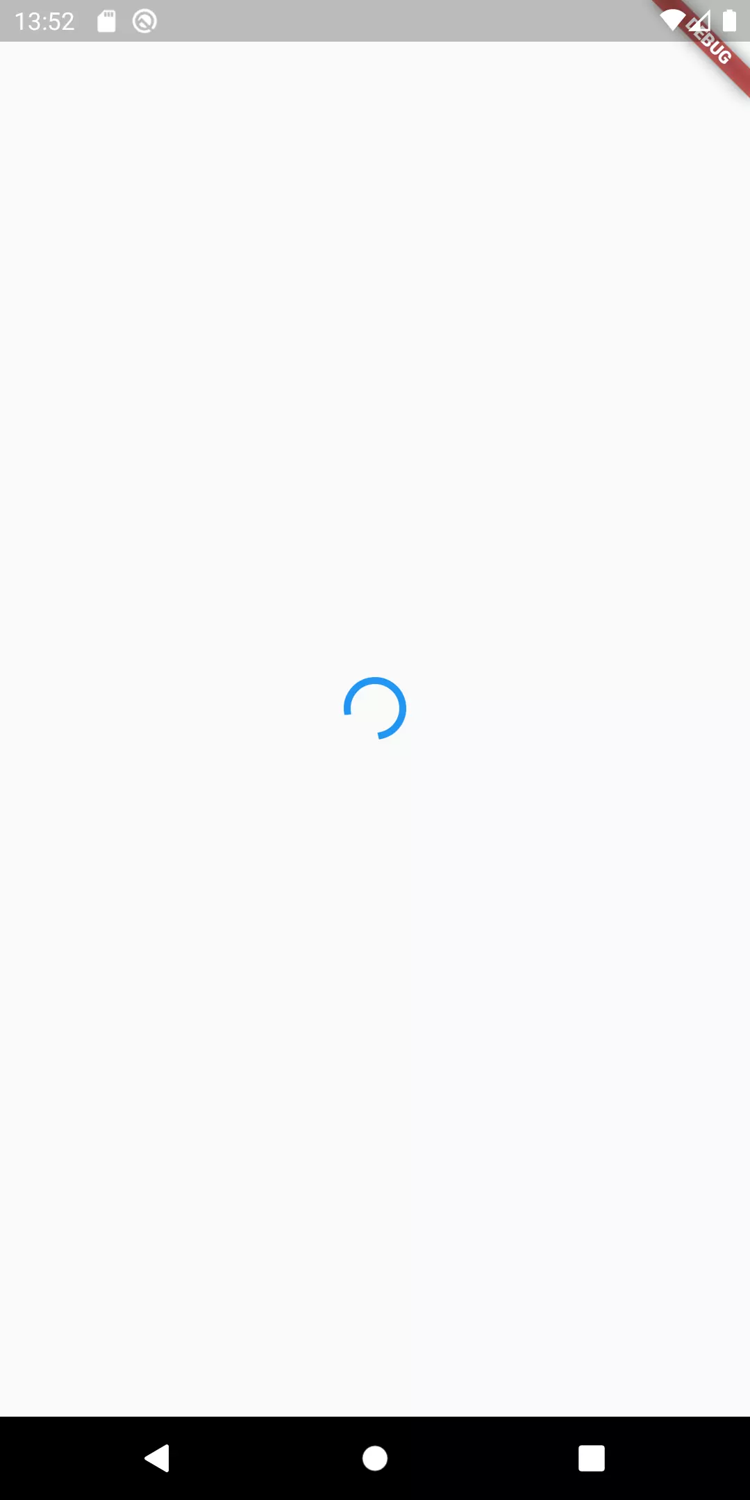
Flutter already provides us two progress indicators as material widgets: the LinearProgressIndicator and the CircularProgressIndicator and this is awesome! Since they are nothing else but Widgets, we can use them just like that:
That would give us something like this:

A little bit of text for a descriptive progress indicator
Now what we want is to display a context so that the user knows, what he is actually waiting for. So let’s add some descriptive text and put everything in a container to make it stand out from the rest of the widget.
 1Container(
 2    padding: EdgeInsets.all(16),
 3    color: Colors.black.withOpacity(0.8),
 4    child: Column(
 5      mainAxisAlignment: MainAxisAlignment.center,
 6      mainAxisSize: MainAxisSize.min,
 7      children: [
 8        _getLoadingIndicator(),
 9        _getHeading(),
10        _getText('Text')
11      ]
12  )
13)
14
15Widget _getLoadingIndicator() {
16  return Padding(
17    child: Container(
18        child: CircularProgressIndicator(
19            strokeWidth: 3
20        ),
21        width: 32,
22        height: 32
23    ),
24    padding: EdgeInsets.only(bottom: 16)
25  );
26}
27
28Widget _getHeading() {
29  return Padding(
30    child: Text(
31      'Please wait …',
32      style: TextStyle(
33        color: Colors.white,
34        fontSize: 16
35      ),
36      textAlign: TextAlign.center,
37    ),
38    padding: EdgeInsets.only(bottom: 4)
39  );
40}
41
42Widget _getText(String displayedText) {
43  return Text(
44    displayedText,
45    style: TextStyle(
46        color: Colors.white,
47        fontSize: 14
48    ),
49    textAlign: TextAlign.center,
50  );
51}
That looks like a lot of change but essentially what I’ve done is wrapping everything in a Container widget, giving it a semi-transparent background color and some padding. Then, I want the indicator we built above, some generic text (“Please wait …”) and a little more detailed explanation on what is done.
Since we have three widgets among themselves, I decided to use a Column widget and put the three just mentioned components in there. To keep it readable, I outsourced every component in a separate method.
Now, what we have is something like that:

Looks kind of what we want to achieve. But before we refine the visuals, let’s think about how we want to display it. I said I would want to display this on top of everything. After all, that would mean nothing more than a Stack widget with the loading indicator as the last child element. But what be the consequences for a project with more than one route? Every route would need to have a Stack widget in its root with the LoadingIndicator in it and a variable storing whether to display it.
Another approach could be to have a root Widget that has this kind of structure and then every route widget as a child of that. One could then use InheritedWidget or provider to make this controllable from every child widget.
Still, this does not feel like the best approach to me. There is something else we can do: the material package already gives us the possibility to show a dialog.
The great thing about it: this brings many options we need anyways:
- An overlay that puts the attention to the progress indicator
- The parameter barrierDismissible that prevents the user from dismissing the dialog by tapping the overlay background
- shape parameter that enables us to enclose the dialog in a container with rounded corners
Let’s first wrap the code we’ve written so far in a separate file and a StatelessWidget called LoadingIndicator. I’ve already done this and uploaded a gist.
Using showDialog() and AlertDialog widget
Now, how do show that dialog? Let’s try it with this piece of code:
 1void showLoadingIndicator([String text]) {
 2  showDialog(
 3    context: context,
 4    builder: (BuildContext context) {
 5      return AlertDialog(
 6        content: LoadingIndicator(
 7          text: text
 8        ),
 9      );
10    },
11  );
12}
The showDialog has two mandatory arguments: context (referring to a BuildContext) and builder which is nothing else than a function with a BuildContext as its only argument.
In the builder function we return an AlertDialog. The only content is the LoadingIndicator we just implemented.

We’re getting nearer to the desired result. But there are still some caveats:
- There is a border around the LoadingIndicator
- The user can dismiss the dialog by tapping anywhere on the background
- The (Android) user can dismiss the dialog by using the hardware back button of his phone
- The dialog does not have round corners
This is how we can fix the mentioned issues:
 1void showLoadingIndicator([String text]) {
 2  showDialog(
 3    context: context,
 4    barrierDismissible: false,
 5    builder: (BuildContext context) {
 6      return WillPopScope(
 7        onWillPop: () async => false,
 8        child: AlertDialog(
 9          shape: RoundedRectangleBorder(
10            borderRadius: BorderRadius.all(Radius.circular(8.0))
11          ),
12          backgroundColor: Colors.black87,
13          content: LoadingIndicator(
14            text: text
15          ),
16        )
17      );
18    },
19  );
20}
Let me explain what this codes snippet does:
- In order to get rid of the border, I the set backgroundColor of the AlertDialog which is the same color as the LoadingIndicator
- Round corners are achieved by assigning RoundedRectangleBorder to the shape argument of the AlertDialog widget
- Preventing the user to dismiss the dialog by tapping the background can be done with barrierDismissible: false
- The ability to dismiss the dialog by using the back button was dealt with wrapping a WillPopScope around everything. The onWillPop argument is filled with a function that does nothing in particular, except for returning false

But now that we prevent the user from dismissing the dialog, how are we dismissing it programmatically after the loading has finished, you might ask yourself.
Good question! Since showDialog does eventually nothing else than Navigator.push, we can reverse the operation by popping that from the stack:
Aaand action!
To see it in action, I prepared a to-be-copied solution based on the sample app of Flutter that has a FloatingActionButton that increases a counter. In the example I simulate that the addition takes 2 seconds (by using a delayed Future). During that operation the user is faced with the above built dialog. Here is what it looks like:


Keith DC
Marc
In reply to Keith DC's comment