This article is about borders. Not only the boring default one, but also the fun ones that make the containing widget stand out.
The goal
Apart from the basic usage I want you to learn how to draw special borders with gradients and gaps like these:

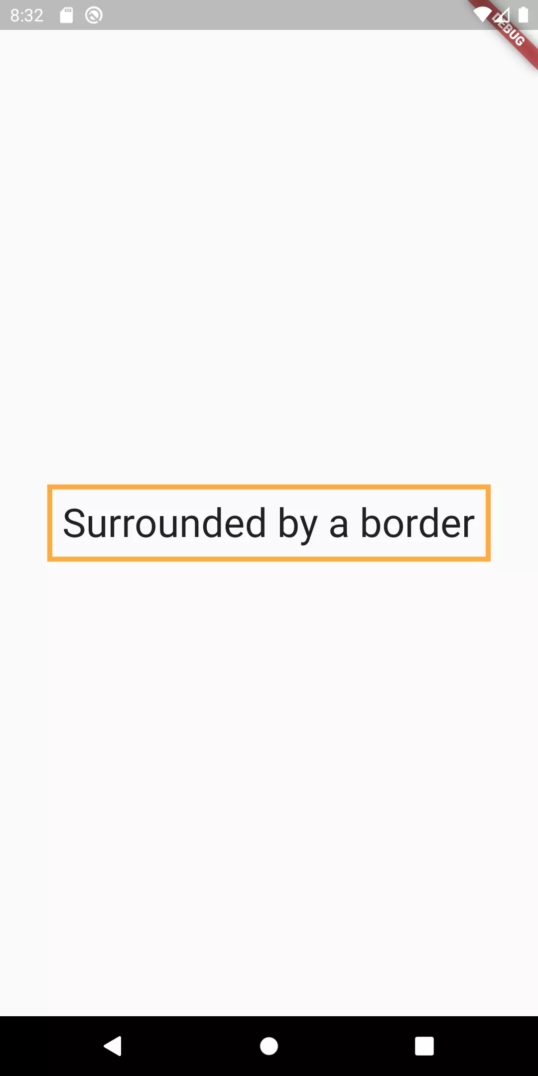
A simple border around a simple widget
But let’s start with something simple: how do we draw a single-colored border around a widget?
1Container(
2  padding: const EdgeInsets.all(8),
3  decoration: BoxDecoration(
4    border: Border.all(color: Colors.orangeAccent, width: 4)
5  ),
6  child: Text("Surrounded by a border", style: TextStyle(fontSize: 32),),
7);
We wrap a container around the widget (in this case the Text widget) and use a BoxDecoration to define border width and color. In fact, using the Border constructor instead of Border.all, we can even control each of the four sides independently.
Stroke border
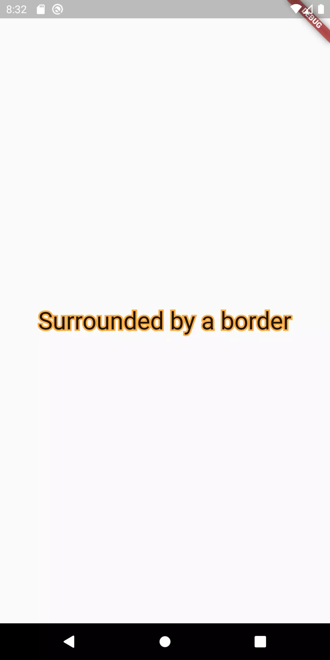
When you think of border around text, you might rather think about a stroke that encloses every character instead of a rectangle defined by the outer Container with a border. For this purpose, we can use the foreground property of the TextStyle class.
 1Stack(
 2  children: [
 3    Text(
 4      'Surrounded by a border',
 5      style: TextStyle(
 6        fontSize: 32,
 7        foreground: Paint()
 8          ..style = PaintingStyle.stroke
 9          ..strokeWidth = 4
10          ..color = Colors.orangeAccent,
11      ),
12    ),
13    Text(
14      'Surrounded by a border',
15      style: TextStyle(
16        fontSize: 32,
17        color: Colors.redAccent,
18      ),
19    ),
20  ]
21);
If we used only the first Text widget, in the Stack we would only have the stroke. Instead, we also want the fill. That’s why I chose a Stack widget that paints the border in the background and the fill in the foreground. Just stacking two Text widgets with different font sizes on top of each other will not work because the text is scaled from the center.
Gradient border
Okay, let’s take the next step: instead of just having a single-colored border around a widget, we proceed to draw a gradient around it. This will get a little bit more complicated, but no worries, I will go through it step by step.
Let’s start by implementing a CustomPainter, the one that actually draws the border.
But first, let’s think a moment what this class should do:
- In order to draw a border with a gradient, we need at least two pieces of information: the
Gradientitself (containing information like the colors and how they are drawn) and the stroke width - We draw an (inner) rectangle around the widget that we want to have bordered. It has to be an inner rectangle because we don’t want to exceed the size of the widget we want to enclose
 1class GradientPainter extends CustomPainter {
 2  GradientPainter({this.gradient, this.strokeWidth});
 3
 4  final Gradient gradient;
 5  final double strokeWidth;
 6  final Paint paintObject = Paint();
 7
 8  @override
 9  void paint(Canvas canvas, Size size) {
10    Rect innerRect = Rect.fromLTRB(strokeWidth, strokeWidth, size.width - strokeWidth, size.height - strokeWidth);
11    Rect outerRect = Offset.zero & size;
12
13    paintObject.shader = gradient.createShader(outerRect);
14    Path borderPath = _calculateBorderPath(outerRect, innerRect);
15    canvas.drawPath(borderPath, paintObject);
16  }
17
18  Path _calculateBorderPath(Rect outerRect, Rect innerRect) {
19    Path outerRectPath = Path()..addRect(outerRect);
20    Path innerRectPath = Path()..addRect(innerRect);
21    return Path.combine(PathOperation.difference, outerRectPath, innerRectPath);
22  }
23
24  @override
25  bool shouldRepaint(CustomPainter oldDelegate) => true;
26}
So what we do is making use of a shortcut. Instead of drawing four rectangles (the four sides of our border), we add two paths: the outer rectangle that has the same size as the widget and the inner rectangle that has the same size but subtracted by the given strokeWidth. Then we use PathOperation.difference to calculate the difference. The difference between a bigger and a smaller rectangle is a stroke around the smaller one.
To make the gradient work as well, we need to add a shader to the paintObject. We use the createShader method for that and provide the outerRect as an argument to make the gradient reach the outer edges.
Now in order to be able to use that GradientPainter, we have to create an enclosing widget that takes a child widget (e. g. a Text) and then draws our Gradient around it.
 1class GradientBorderButtonContainer extends StatelessWidget {
 2  GradientBorderButtonContainer({
 3    @required gradient,
 4    @required this.child,
 5    this.strokeWidth = 4,
 6  }) : this.painter = GradientPainter(
 7      gradient: gradient, strokeWidth: strokeWidth
 8  );
 9
10  final GradientPainter painter;
11  final Widget child;
12  final VoidCallback onPressed;
13  final double strokeWidth;
14
15  @override
16  Widget build(BuildContext context) {
17    return CustomPaint(
18        painter: painter,
19        child: child
20    );
21  }
22}

Rounded edges
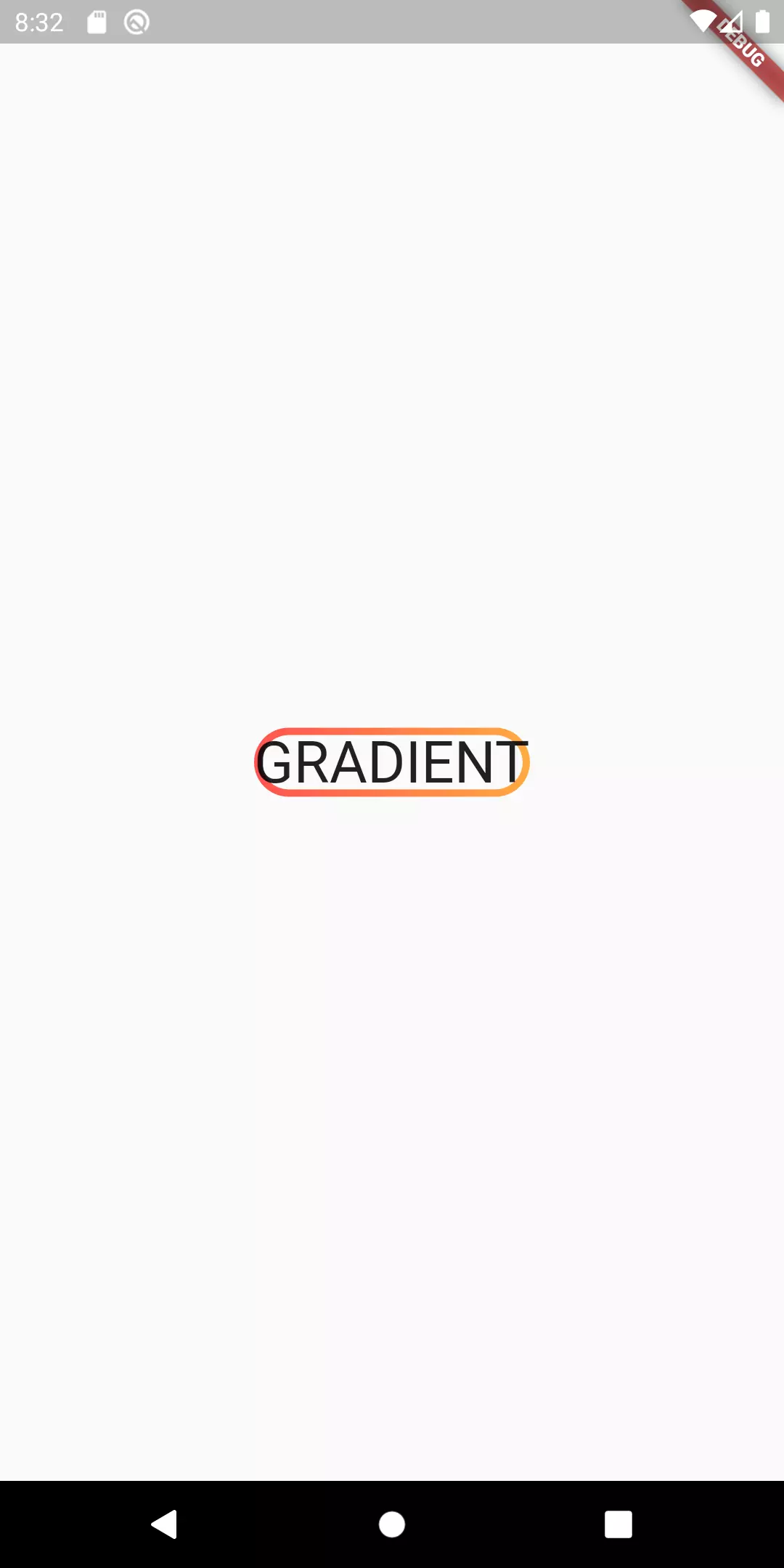
Now we want the border to be round instead of having the hard rectangle corners.
 1class GradientPainter extends CustomPainter {
 2  GradientPainter({this.gradient, this.strokeWidth, this.borderRadius});
 3
 4  final Gradient gradient;
 5  final double strokeWidth;
 6  final double borderRadius;
 7  final Paint paintObject = Paint();
 8
 9  @override
10  void paint(Canvas canvas, Size size) {
11    Rect innerRect = Rect.fromLTRB(strokeWidth, strokeWidth, size.width - strokeWidth, size.height - strokeWidth);
12    RRect innerRoundedRect = RRect.fromRectAndRadius(innerRect, Radius.circular(borderRadius));
13
14    Rect outerRect = Offset.zero & size;
15    RRect outerRoundedRect = RRect.fromRectAndRadius(outerRect, Radius.circular(borderRadius));
16
17    paintObject.shader = gradient.createShader(outerRect);
18    Path borderPath = _calculateBorderPath(outerRoundedRect, innerRoundedRect);
19    canvas.drawPath(borderPath, paintObject);
20  }
21
22  Path _calculateBorderPath(RRect outerRRect, RRect innerRRect) {
23    Path outerRectPath = Path()..addRRect(outerRRect);
24    Path innerRectPath = Path()..addRRect(innerRRect);
25    return Path.combine(PathOperation.difference, outerRectPath, innerRectPath);
26  }
27
28  @override
29  bool shouldRepaint(CustomPainter oldDelegate) => true;
30}
 1class GradientBorderContainer extends StatelessWidget {
 2  GradientBorderContainer({
 3    @required gradient,
 4    @required this.child,
 5    @required this.onPressed,
 6    this.strokeWidth = 4,
 7    this.borderRadius = 64
 8  	}) : this.painter = GradientPainter(
 9      gradient: gradient, strokeWidth: strokeWidth, borderRadius: borderRadius
10  );
11
12  final GradientPainter painter;
13  final Widget child;
14  final VoidCallback onPressed;
15  final double strokeWidth;
16  final double borderRadius;
17  final double padding;
18
19  @override
20  Widget build(BuildContext context) {
21    return CustomPaint(
22        painter: painter,
23        child: child
24    );
25  }
26}
It is quite simple: we create RRect (rounded rectangles) based on the given Rects we used above and a radius we let the caller define in the constructor of our GradientBorderContainer widget.
Giving it a padding
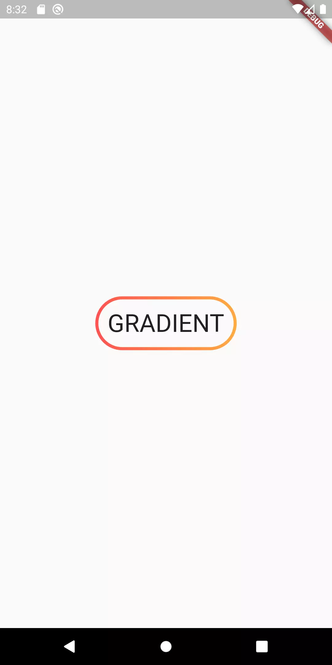
Looks better but there is still room for improvement. The text looks like it is too near to the border, it actually touches the border. So let’s give it a padding.
 1class GradientBorderContainer extends StatelessWidget {
 2  GradientBorderContainer({
 3    @required gradient,
 4    @required this.child,
 5    @required this.onPressed,
 6    this.strokeWidth = 4,
 7    this.borderRadius = 64,
 8    this.padding = 16
 9  	}) : this.painter = GradientPainter(
10      gradient: gradient, strokeWidth: strokeWidth, borderRadius: borderRadius
11  );
12
13  final GradientPainter painter;
14  final Widget child;
15  final VoidCallback onPressed;
16  final double strokeWidth;
17  final double borderRadius;
18  final double padding;
19
20  @override
21  Widget build(BuildContext context) {
22    return CustomPaint(
23        painter: painter,
24        child: Container(
25          padding: EdgeInsets.all(padding),
26          child: child
27        )
28    );
29  }
30}
Once again we touch the constructor of our GradientBorderContainer widget. We extend it by one parameter called padding which defaults to 16. We then use this padding to wrap a Container around the child widget with the respective padding.
Ripple effect
Looks great, doesn’t it? Now we can focus our improvent on the actual interaction. Since it looks like a button, we want to give it a feedback once the user touches it. We go for the classic Material ripple effect.
 1class GradientBorderContainer extends StatelessWidget {
 2  GradientBorderContainer({
 3    @required gradient,
 4    @required this.child,
 5    @required this.onPressed,
 6    this.strokeWidth = 4,
 7    this.borderRadius = 64,
 8    this.padding = 16,
 9    splashColor
10  }) :
11  this.painter = GradientPainter(
12    gradient: gradient, strokeWidth: strokeWidth, borderRadius: borderRadius
13  ),
14  this.splashColor = splashColor ?? gradient.colors.first;
15
16  final GradientPainter painter;
17  final Widget child;
18  final VoidCallback onPressed;
19  final double strokeWidth;
20  final double borderRadius;
21  final double padding;
22  final Color splashColor;
23
24  @override
25  Widget build(BuildContext context) {
26    return CustomPaint(
27      painter: painter,
28        child: InkWell(
29          highlightColor: Colors.transparent,
30          splashColor: splashColor,
31          borderRadius: BorderRadius.circular(borderRadius),
32          onTap: onPressed,
33          child: Container(
34            padding: EdgeInsets.all(padding + strokeWidth),
35              child: child
36          ),
37        ),
38    );
39  }
The ripple effect can be achieved by using an InkWell. The splashColor determines the color of the circle that grows as long as you tap down. We set it to the first color of the gradient unless something else is provided. This way, the effect still looks cool when no extra color is given. The highlightColor is set to Colors.transparent because otherwise it defaults to a grey that makes it look worse in my opinion. The InkWell needs the borderRadius as well. If we omitted it the splash would exceed the borders of the child.

Yo dawg, I heard you like borders
There’s one last thing I would like us to improve. I noticed, when I used gradients with repeated patterns that contain a white color or generally contain the same color as background, it becomes harder to see the border.
 1GradientBorderContainer(
 2  strokeWidth: 16,
 3  borderRadius: 16,
 4  gradient: LinearGradient(
 5    begin: Alignment.topLeft,
 6    end: Alignment(-0.2, -0.4),
 7    stops: [0.0, 0.25, 0.25, 0.5, 0.5, 0.75, 0.75, 1],
 8    colors: [
 9      Colors.pinkAccent,
10      Colors.pinkAccent,
11      Colors.white,
12      Colors.white,
13      Colors.pinkAccent,
14      Colors.pinkAccent,
15      Colors.white,
16      Colors.white,
17    ],
18    tileMode: TileMode.repeated,
19  ),
20  child: Text('NEED OUTER BORDER!',
21      style: TextStyle(fontSize: 32, fontWeight: FontWeight.bold)),
22  onPressed: () {},
23);
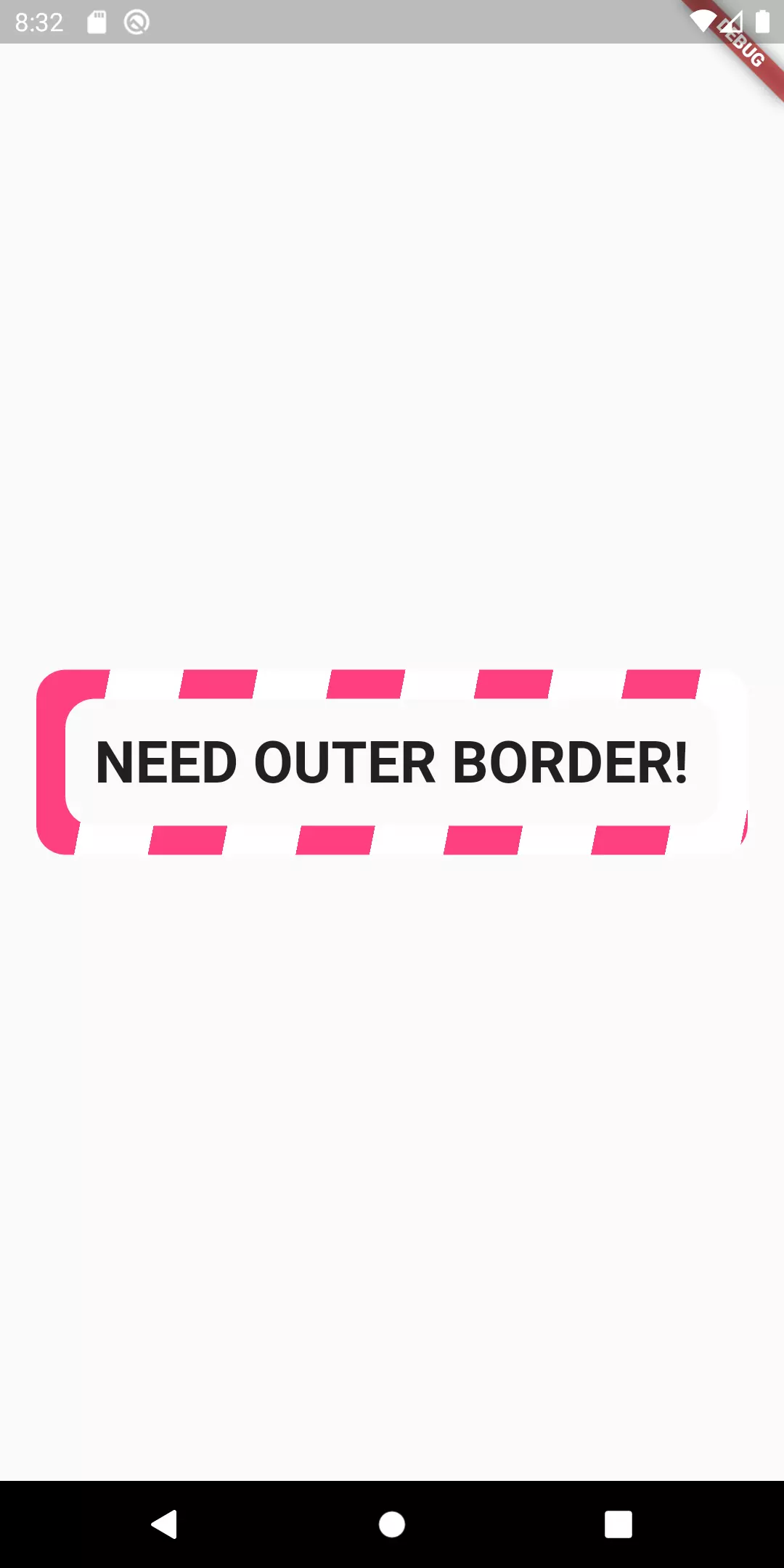
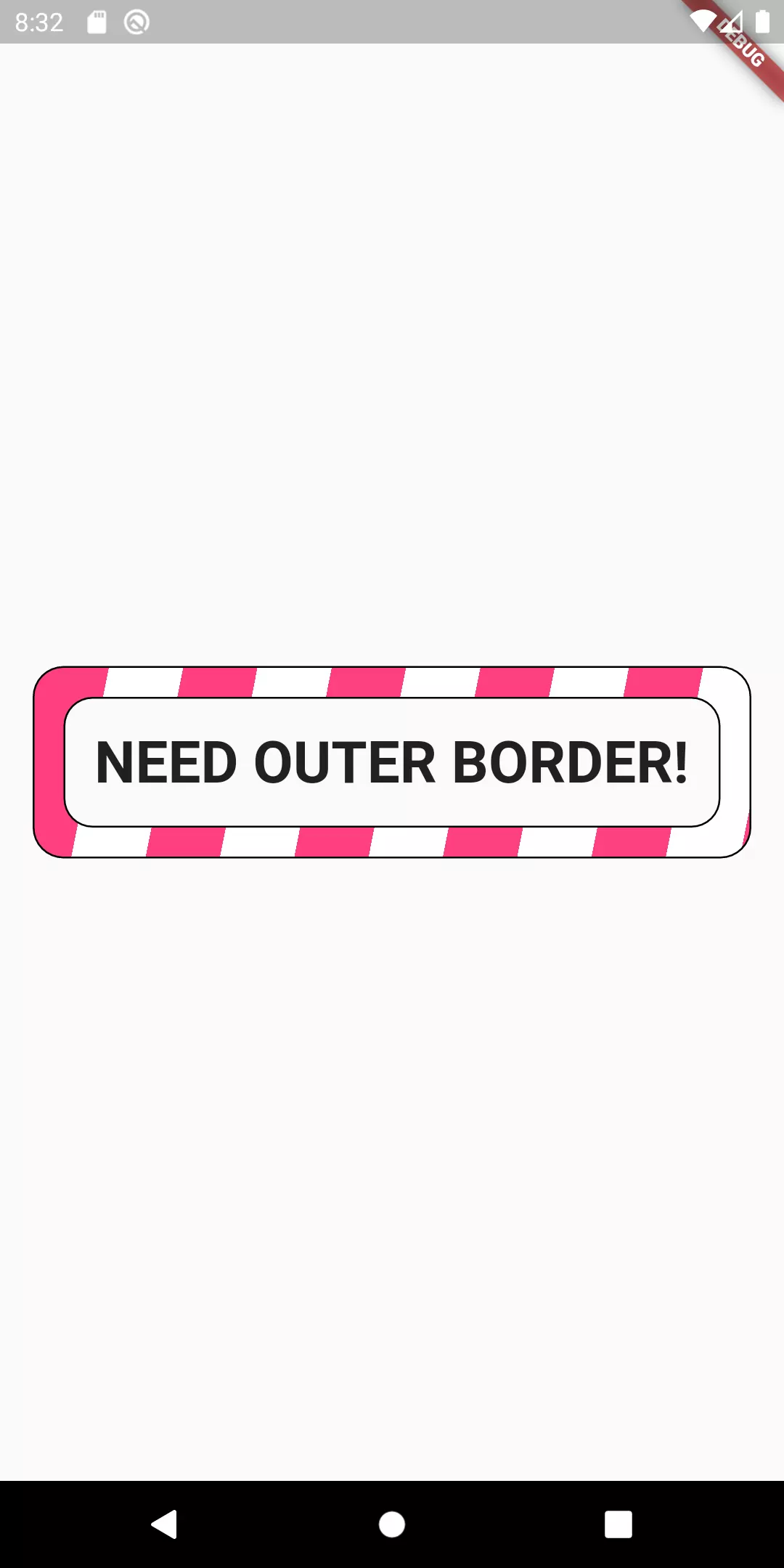
That’s why we need a border around the border. Let’s call it outline to make a better distinction.
 1class GradientPainter extends CustomPainter {
 2  GradientPainter({this.gradient, this.strokeWidth, this.borderRadius, this.outlineWidth});
 3
 4  final Gradient gradient;
 5  final double strokeWidth;
 6  final double borderRadius;
 7  final double outlineWidth;
 8  final Paint paintObject = Paint();
 9
10  @override
11  void paint(Canvas canvas, Size size) {
12    if (outlineWidth > 0) {
13      _paintOutline(outlineWidth, size, canvas);
14    }
15
16    Rect innerRect = Rect.fromLTRB(
17        strokeWidth, strokeWidth, size.width - strokeWidth, size.height - strokeWidth
18    );
19    RRect innerRoundedRect = RRect.fromRectAndRadius(innerRect, Radius.circular(borderRadius));
20
21    Rect outerRect = Offset.zero & size;
22    RRect outerRoundedRect = RRect.fromRectAndRadius(outerRect, Radius.circular(borderRadius));
23
24    paintObject.shader = gradient.createShader(outerRect);
25    Path borderPath = _calculateBorderPath(outerRoundedRect, innerRoundedRect);
26    canvas.drawPath(borderPath, paintObject);
27  }
28
29  void _paintOutline(double outlineWidth, Size size, Canvas canvas) {
30    Paint paint = Paint();
31    Rect innerRectB = Rect.fromLTRB(
32        strokeWidth + outlineWidth,
33        strokeWidth + outlineWidth,
34        size.width - strokeWidth - outlineWidth,
35        size.height - strokeWidth - outlineWidth
36    );
37    RRect innerRRectB = RRect.fromRectAndRadius(innerRectB, Radius.circular(borderRadius - outlineWidth));
38
39    Rect outerRectB = Rect.fromLTRB(-outlineWidth, -outlineWidth, size.width + outlineWidth, size.height + outlineWidth);
40    RRect outerRRectB = RRect.fromRectAndRadius(outerRectB, Radius.circular(borderRadius + outlineWidth));
41
42    Path borderBorderPath = _calculateBorderPath(outerRRectB, innerRRectB);
43    paint.color = Colors.black;
44    canvas.drawPath(borderBorderPath, paint);
45  }
46
47  Path _calculateBorderPath(RRect outerRRect, RRect innerRRect) {
48    Path outerRectPath = Path()..addRRect(outerRRect);
49    Path innerRectPath = Path()..addRRect(innerRRect);
50    return Path.combine(PathOperation.difference, outerRectPath, innerRectPath);
51  }
52
53  @override
54  bool shouldRepaint(CustomPainter oldDelegate) => true;
55}
 1class GradientBorderContainer extends StatelessWidget {
 2  GradientBorderContainer({
 3    ...
 4    this.outlineWidth = 1
 5  }) :
 6  this.painter = GradientPainter(
 7    outlineWidth: outlineWidth
 8  ),
 9  this.splashColor = splashColor ?? gradient.colors.first;
10  final double outlineWidth;
11
12  @override
13  Widget build(BuildContext context) {
14    return CustomPaint(
15      painter: painter,
16        child: InkWell(
17          highlightColor: Colors.transparent,
18          splashColor: splashColor,
19          borderRadius: BorderRadius.circular(borderRadius),
20          onTap: onPressed,
21          child: Container(
22            padding: EdgeInsets.all(padding + strokeWidth + outlineWidth),
23              child: child
24          ),
25        ),
26    );
27  }
28  ...
29}
Another argument is added to the constructor: outlineWidth. It determines whether an outline should be visible and what the width of that outline should be.
Partial border
So far, we have drawn a border that is drawn continuously. Let’s look at something new: trying to draw only the top left corner and the bottom right corner.
 1class PartialPainter extends CustomPainter {
 2  PartialPainter({this.radius, this.strokeWidth, this.gradient});
 3
 4  final Paint paintObject = Paint();
 5  final double radius;
 6  final double strokeWidth;
 7  final Gradient gradient;
 8
 9  @override
10  void paint(Canvas canvas, Size size) {
11    Rect topLeftTop = Rect.fromLTRB(0, 0, size.height / 4, strokeWidth);
12    Rect topLeftLeft = Rect.fromLTRB(0, 0, strokeWidth, size.height / 4);
13
14    Rect bottomRightBottom = Rect.fromLTRB(size.width - size.height / 4, size.height - strokeWidth, size.width, size.height);
15    Rect bottomRightRight = Rect.fromLTRB(size.width - strokeWidth, size.height * 3 / 4, size.width, size.height);
16
17    paintObject.shader = gradient.createShader(Offset.zero & size);
18
19    Path topLeftPath = Path()
20      ..addRect(topLeftTop)
21      ..addRect(topLeftLeft);
22
23    Path bottomRightPath = Path()
24      ..addRect(bottomRightBottom)
25      ..addRect(bottomRightRight);
26
27    Path finalPath = Path.combine(PathOperation.union, topLeftPath, bottomRightPath);
28
29    canvas.drawPath(finalPath, paintObject);
30  }
31  @override
32  bool shouldRepaint(CustomPainter oldDelegate) => true;
33}
If you have seen and understood the previous examples, then this is probably not too hart to understand. We draw four rectangles, each representing a side of the indicated border. The length of the respective rectangles is dependent on the height of the child widget (a quarter of that). We then use PathOperation.union to combine the paths.

Final thoughts
Using a CustomPainter, it’s possible to achieve a lot more flexibility when it comes to drawing a border around a widget. In this tutorial, aside from the basics, we have learned how to draw a configurable gradient border around a widget. We are able to set a gradient, padding, a stroke width and the width of the outline around the border. On top of that, to indicate user interaction we have a ripple effect provided by an InkWell widget. Additionally, we have seen how it’s possible to have only parts of the border drawn (by leaving gaps).


Comment this 🤌